8 min to read
No, That fancy icon is not your Logo!
Who needs all those logo variations? Not me.
The title sounds provocative, and it is meant to be. This post is the designer in me stepping forward, sleeves rolled up, armed with my magic wand (Photoshop) ready to drive a point home! 🚀
By photoshop I mean Photopea, GIMP, Canva 🔥, PicsArt, and more!
I am a webmeka.
Here is my short definition of that word before we go any further. A frontend designer handles visuals, layout, and user experience. A backend developer wrestles code, APIs, databases, and logic. Master both, and you become a full-stack developer. Now add branding, graphic design, SEO, analytics, and the unglamorous work of helping a website grow after launch.
That, Ladies and Gentlemen, is a webmeka. 🚀 I see them everywhere, millions of them, they have built the web, they help brands grow online, they run solo agencies! My goal is to have a team of such ‘webmeka’ minded creatives. [email protected] And together we will… - back to the Logo!
Let me tell you shamthing.
Being a webmeka means living at the intersection of design, code, and strategy. Fueled by curiosity. Not a know-it-all.
At this point, I confidently call myself a graphic designer, not because of certificates or job titles, but because of reactions! That split second when the client sees a design and goes WOW!
That reaction, teaches you that design is not about decoration, it is about communication. When someone sees it and knows/feels something click.
Shamthing else.
You know the design is fire when the client says, “DON’T CHANGE ANYTHING! SEND INVOICE”
The spark!
NOW, it all began when I started WEBMEKA. A Creative Design Agency focused on STRATEGY + DESIGN. Project WEBMEKA Logo Design was on! My chance to turn the mirror inward. I was no longer designing for a client. I was the client. That single change broke everything I thought I knew.
Normally, logo design comes with a timeline. A day or two. I respected that limit. Enough time to think, but not enough time to overthink.
This time, however, there was no limit. I started designing the WEBMEKA logo with full confidence. “I am a graphic designer; this should take me a day or two.” Oh boy, wrong was I.
The client.
See, as the client, I did not know what I wanted. But, (This is important) I knew what I did not want.
Weeks passed. The designs piled up. Literally. A folder full of WEBMEKA Logo draft designs.
I recall showing that folder to a friend. He picked three logo on the spot. Three! When I could not even settle on one.
He was right, objectively. They worked. One of them was even my favorite!

I knew this for sure. That if I ever saw the
perfectWEBMEKA Logo, I would recognize it instantly. On sight!
Something was still missing.
The designer.
As the designer, the logo felt close, but not inevitable. The real one felt like it was hiding somewhere inside my head, waiting to be summoned.
Then came the sparkle!
If you have interacted with anything AI lately, you have seen it. The sparkle icon. That little ✨ shape that shows up everywhere AI goes. Mysteriously universal.
This one time, I stared at it and felt something shift. The shape. The energy. The implication. I could see it!

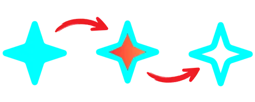
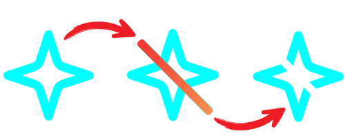
The WEBMEKA Logo was hiding in plain sight! Somewhere inside that sparkling shape. Waiting to be carved out. So I took out my tool of work, a magic wand. Well, Photoshop can do magic if you ask me. I feel like a magician with it.

The spell worked! That was it. The project’s client (Me) confirmed it instantly. “Yes Voke. That is the WEBMEKA Logo. SEND INVOICE ASAP!” LOL, a happy client I was.

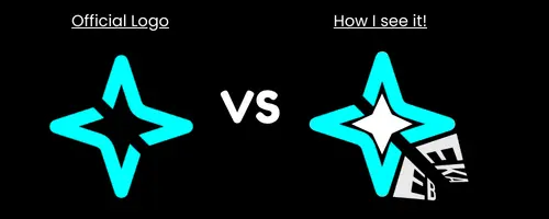
After all that curving, it turns out WEBMEKA exists both inside and outside the sparkle.
Next came the part most designers treat as routine. Export files. Deliver variations. Light background, dark background, social media sizes, profile pictures, and a few mockups. Project done.

This is where the story usually ends.
Halt, and then catch fire!
After exporting the final design in all variations I thought I might need in the future, I now had another folder full of the sparkle-inspired logo files, but in different variations and formats.
This setup worked for a while, but then reality hit hard. Take the profile picture for example, turns out most social media platforms have different size specifications for profile pictures! That meant one ‘profile picture’ image file could not fit all platforms.
Worth mentioning
As a designer, I always admire how some logos for “Big brand” like Google, can easily adapt to different themes and color pallets outside of their brand colors and still retain their value. I wanted WEBMEKA Logo to have those powers too.
So I did something different.
One file to rule them all.
What did I do? I combined my graphic design skills with my web development experience. The result? One Logo file. And the magic? Wait for it… an SVG file!
And NO, I did not convert the existing file to an SVG. Am a developer, I eat code for breakfast! So I opened up my favorite text editor - Kate. And recreated the sparkle shape manually, line by line. Then I used all the SVG editing tricks up my still rolled up sleeves to curve the WEBMEKA Logo out.
The result?
This code snippet below is the official WEBMEKA Logo! paste it into any offline or online SVG viewer to see the magic.
<svg xmlns="http://www.w3.org/2000/svg"
viewBox="0 0 250 250">
  <mask id="a">
    <path fill="#fff" d="M0 0h250v250H0V0z"/>
    <path stroke="#000" stroke-linecap="round"
stroke-width="18" d="M70 70l110 110"/>
  </mask>
  <g fill="none" stroke="#0ff" stroke-linecap="round"
stroke-linejoin="round" stroke-width="20" mask="url(#a)">
    <path d="M125 31.25l-19.79 60.63a20.85 20.85 0 0 1-13.28
13.28L31.25 125l60.63 19.79a20.85 20.85 0 0 1 13.28 13.28L125
218.75l19.79-60.63a20.85 20.85 0 0 1 13.28-13.28L218.75
125l-60.63-19.79a20.85 20.85 0 0 1-13.28-13.28z"/>
  </g>
</svg>
Let me explain the code above in brief, For the curious souls reading this :)
The code language used is XML. The viewBox values define the Logo height and width. The <path> code inside the <g> tag defines and draws the sparkle shape. Note the stroke-width and color values, with fill set to none.
Above it is a mask layer <mask> (Just like mask layers in Photoshop), inside the mask layer is a <path> tag, which draws a diagonal line with a width of 18px. Since that line is inside the mask layer, it gets masked out (hidden alongside everything below it), resulting in that diagonal cut of the sparkle shape below it. Done!
Honestly, Kate text editor deserves its own post! It makes Notepad++ feel like a toy. Always my go-to editor when dealing with a single file. For projects with multiple files, VS Code saves the day like Superman. Look out for that Kate post in the near future.
Why the Sparkle Shape?
No. It is not about trends or AI aesthetics; it works because of what it represents: focus, emergence, and creativity. And with that diagonal cut, the shape feels active rather than static, something small that still commands attention, abstract enough to grow with the brand.
And the sparkle being a star, I wanted WEBMEKA to be up there with the stars, where it belongs!
Why SVG?
Because SVG is not just an image. It is code. Easy to edit even on mobile! No magic wand needed.
With one SVG file, I do not worry about size. Ever. I open it in a text editor, change the values, and save. Done. Need a different color? Change the hex value. Save. Done. Need a PNG for a specific use? Export it. Done. The original SVG file stays untouched. One file to rule them all.
As the designer, I was proud. As the client, I had my WOW moment!
Got me thinking, in the real world, would a client allow for their logo to be crafted and delivered without a timeline? Total creative freedom?
With all that said written, we both (Designer & Client) recommend you hire [email protected] for your next Logo project.
Stay Curious,
Sham.

Leave a Comment